Shaping the UX of a national news platform from the ground up.
I led UX and UI for Al-Qahera News — a 24/7 mobile app delivering diverse, impactful coverage from Egypt, the Arab region and around the world. The goal: real-time updates wrapped in an intuitive interface so readers could seamlessly engage with one of the region's leading TV channels.
What the data told us
Key insights from data gathered on user needs and behaviors, paired with the qualitative goals that came out of interviews and feedback.
- Easy Navigation
- Multimedia Content
- Offline Access
- Notification settings
- Efficiently Consume News
- Stay Ahead in Professional Life
- Engage with High-Quality Content
- Share and Discuss News
Mapping the structure
I collaborated with the Product Manager in a brainstorming session to discuss requirements and prioritize key entities based on their importance to the user. This process helped us map out the site structure and information architecture, using insights from the analysis of the website that had been live for the past two years.
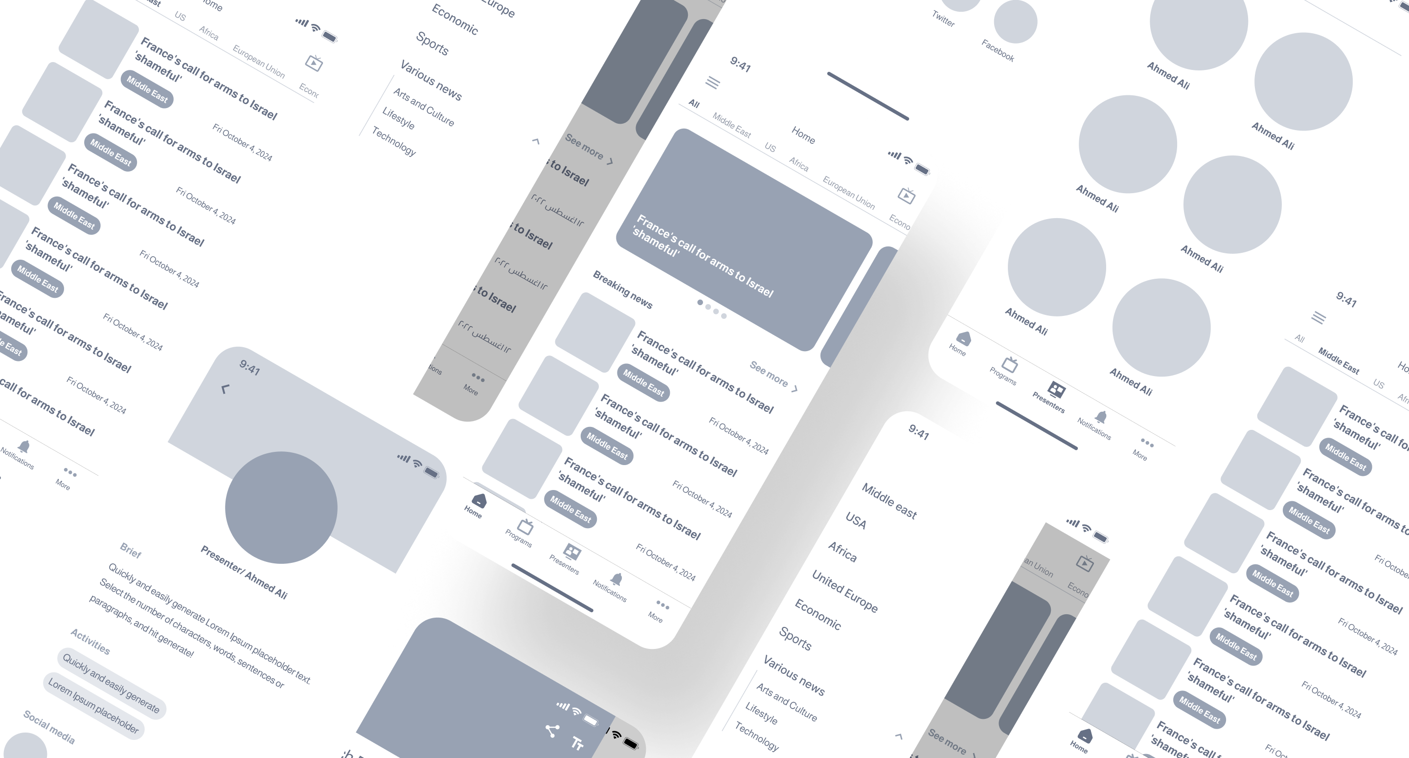
From wireframes to high-fidelity
After completing the wireframe testing and finalizing the structure, I moved on to developing the design system. With the design foundation in place, I created high-fidelity designs and built the final interactive prototype. This prototype was then tested internally and with a select group of users for further feedback and refinement.
What shipped
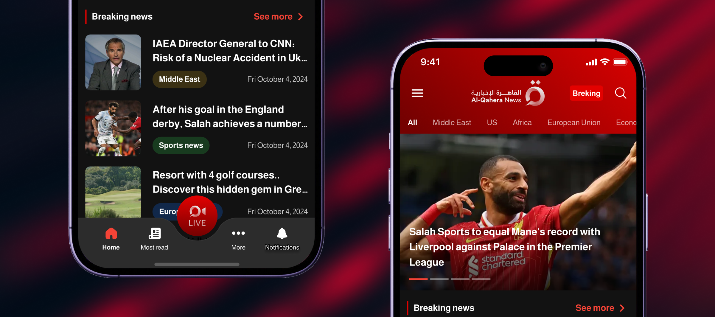
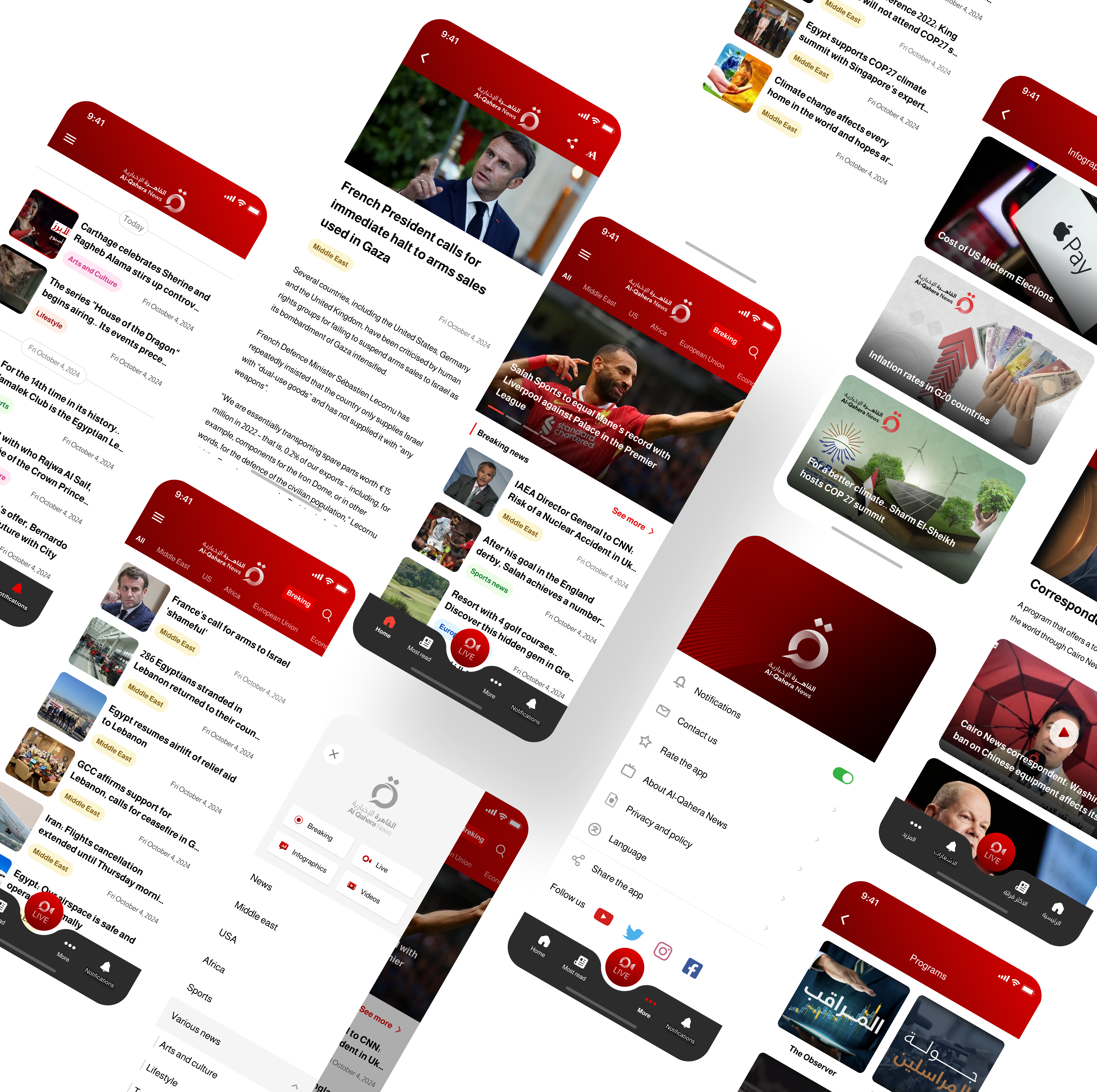
The app launched on iOS and Android as a brand-new product — Al-Qahera News's first native mobile experience. The foundation was deliberately modular, so the editorial team could keep stacking features without breaking the base experience.
- Live TV stream paired with on-demand video and photo galleries
- Breaking-news, programs and most-read sections added in successive releases
- Personalised push notifications for breaking stories and new video uploads
- Maintains a 4.3★ average on the App Store across iOS and Android
What I'd do differently: bring engineering into research sooner. Building from scratch meant we made some platform-specific calls (notifications, video) later than I'd like — earlier dev input would have saved us a sprint of rework.
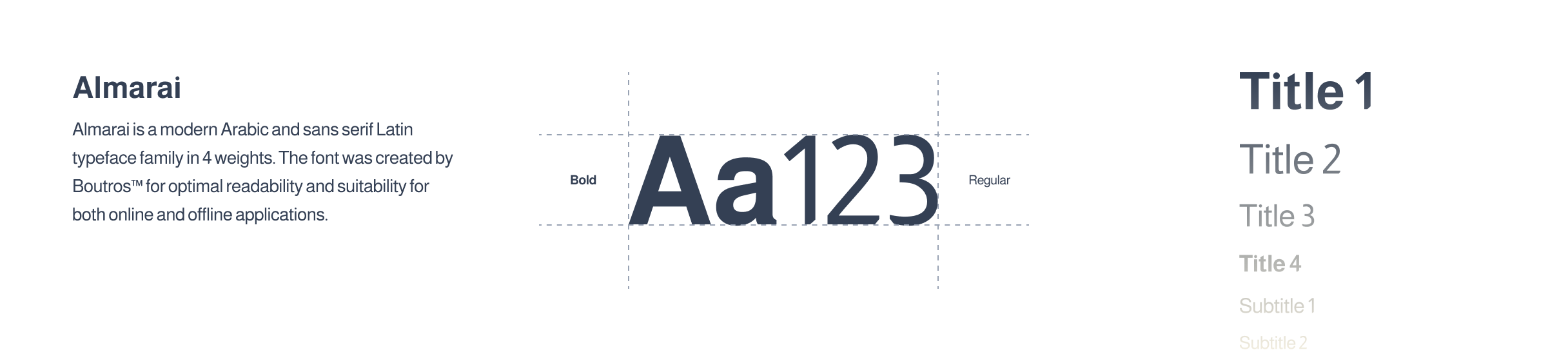
Building blocks
I built a small, opinionated design system so the editorial team could compose new layouts without breaking the brand. Typography, colour and spacing all sit on top of the same primitives — change one token and the whole product follows.
Designed for everyone
Accessibility was a core consideration throughout the design process, ensuring the app is usable for people with a wide range of abilities and preferences.
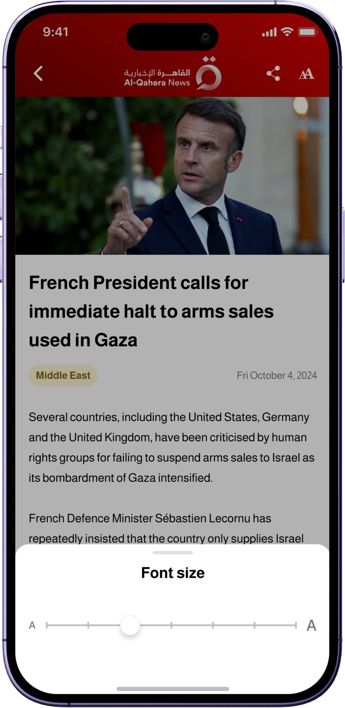
Adjusting Font Size
Users can increase or decrease font size within articles, ensuring readability for individuals with visual impairments or personal preferences for text size.
Changing Language
The app supports multiple languages, allowing users to switch to their preferred language seamlessly for a diverse, multilingual audience.
Color Contrast
High color contrast ratios between text and background elements enhance readability, especially for users with color blindness or low vision.
Accessible Media
All images and videos include alternative text or captions, ensuring users with visual or hearing impairments can fully understand the content.