Redesigning a travel booking experience for Egypt’s modern travelers.
I led the end-to-end redesign of Halla Travel across iOS and Android — rebuilding the product experience, crafting a scalable design system with dark mode support, and creating the full brand identity from scratch.
The trip was easy. Booking it wasn’t.
Egyptian travelers were juggling three or four apps, a handful of agency phone calls and a pile of screenshots just to book a single trip. Halla’s first version had the inventory — flights, hotels, tours and honeymoon packages — but the experience around it felt fragmented and hard to trust.
Nothing tied the journey together: prices were buried, screens looked like they came from different products, and there was no moment of inspiration to make you actually want to travel.
- Fragmented booking flow across flights, hotels and tours
- Inconsistent visual language eroding trust
- Weak hierarchy — prices and key details hard to scan
- No emotional pull or travel inspiration
- No scalable component system
- One-off screens that broke as features were added
- No dark mode and no shared tokens
- Brand applied unevenly across the product
What success looked like
Before touching a single screen I set the bar with the team: a simpler, more trustworthy booking experience built on foundations we could keep growing — not another redesign we’d outgrow in a year.
- Simplify the end-to-end booking flow
- Increase trust in the platform
- Build stronger brand recognition
- Inspire travel, not just transact it
- Create scalable UI foundations
- Improve visual consistency across platforms
- Support dark mode from day one
- Speed up future feature work
Discovery & audit
I started by auditing the existing app screen-by-screen and studying how the strongest travel products handle search, pricing and checkout — then mapped that against how Egyptian travelers actually book today.
- Too many steps to compare options
- Unclear total price until checkout
- Low confidence in completing payment
- Inspire with curated destinations
- Show transparent, all-in pricing
- Familiar, local payment methods
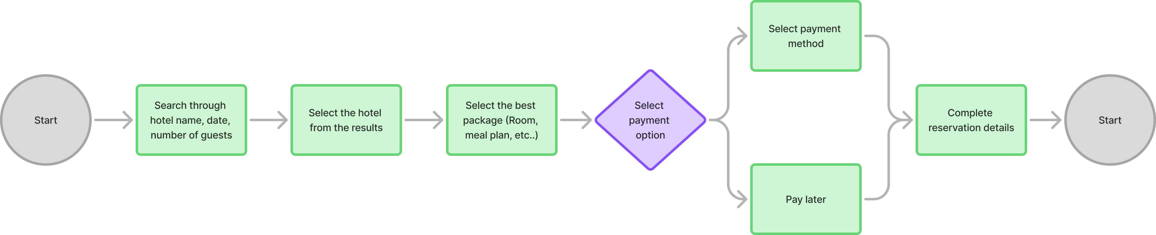
Mapping the journey
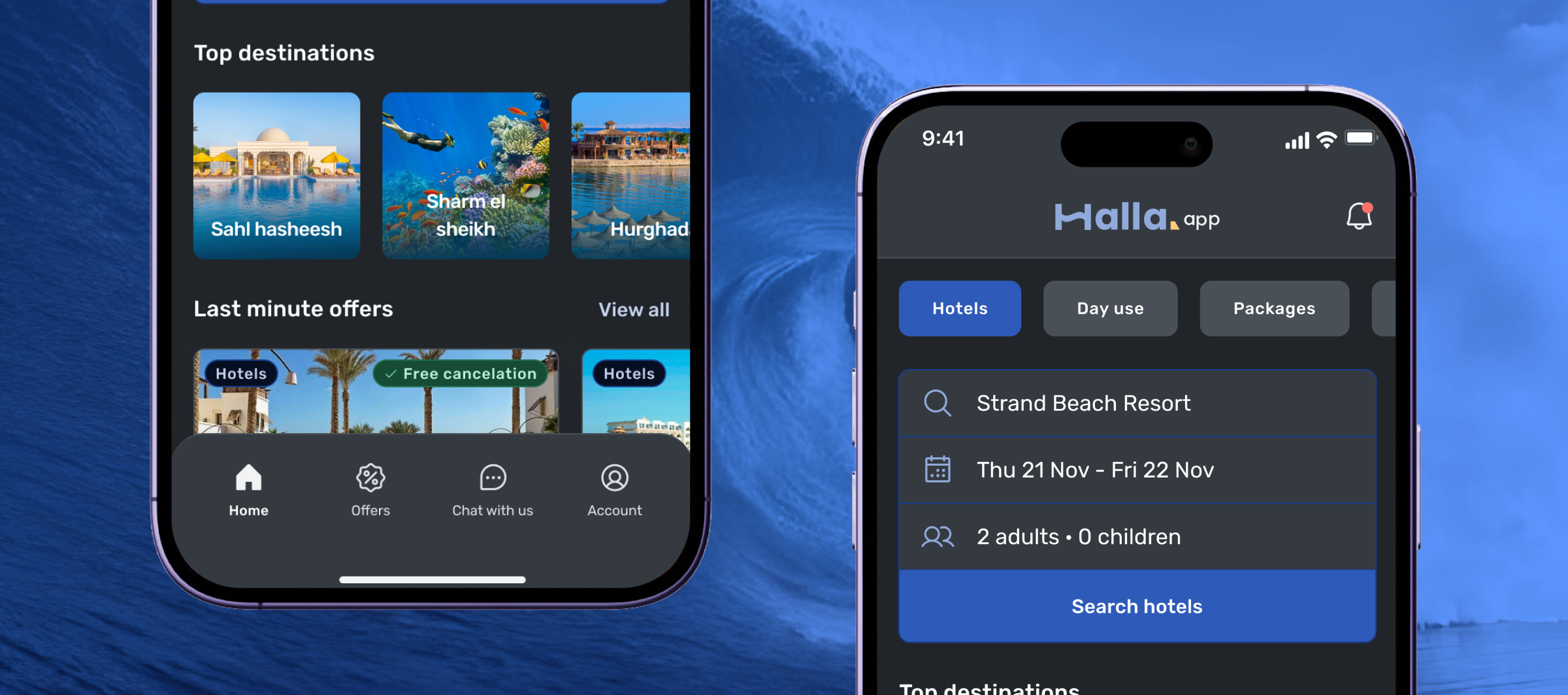
I restructured the app around the way people actually plan: inspiration first, then a focused path to book. The booking journey — from browsing a destination through to confirmation — became the spine the whole product hangs off.
A brand that feels like the sea
“Halla” is an open, welcoming hello. I built the identity around that warmth — a deep ocean blue, a warm sunset orange for the moments worth booking, and a teal that reads like shallow water. The wordmark’s single tilted counter reads as a wave.
- Welcoming, not corporate.
An open “hello” — friendly language and warm visuals over cold transactional UI. - Confident and trustworthy.
Clear pricing and steady structure that reassure first-time bookers. - Bright, sunlit and optimistic.
A sunset accent and airy spacing that make travel feel within reach. - Effortless — the app does the work.
Smart defaults and fewer steps, so planning never feels like a chore.
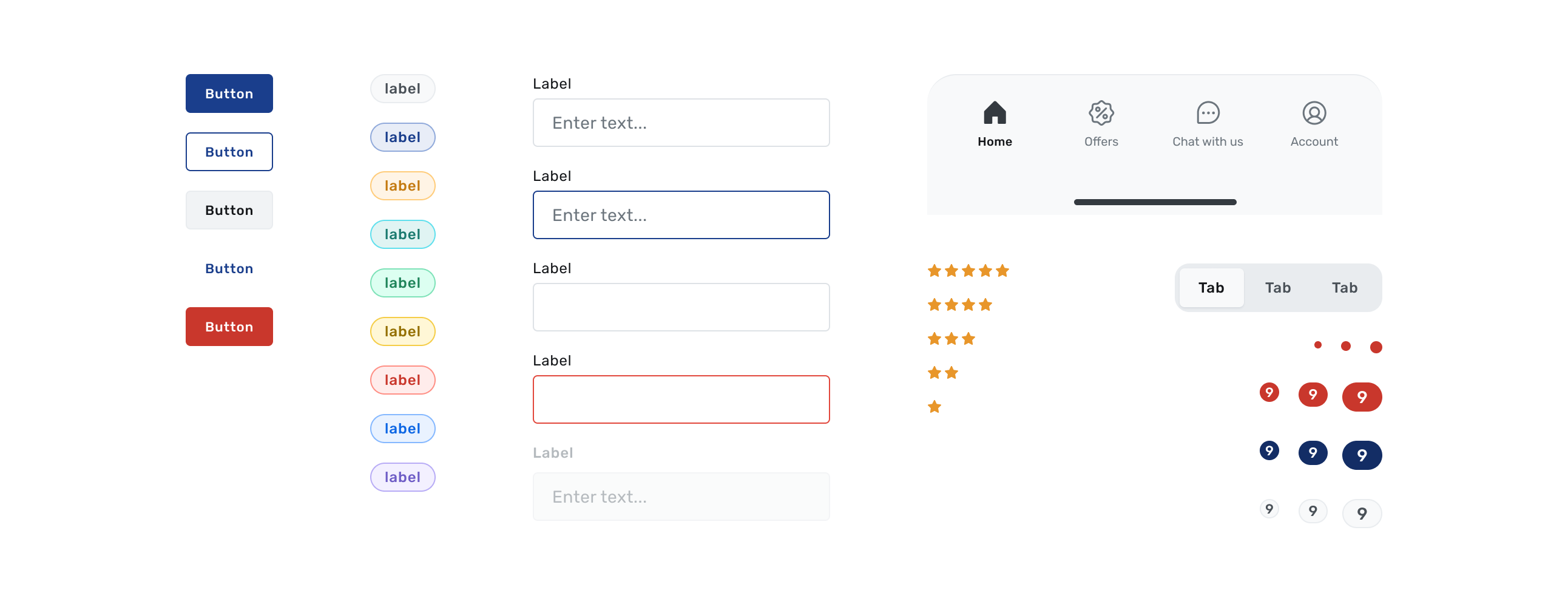
Foundations that scale
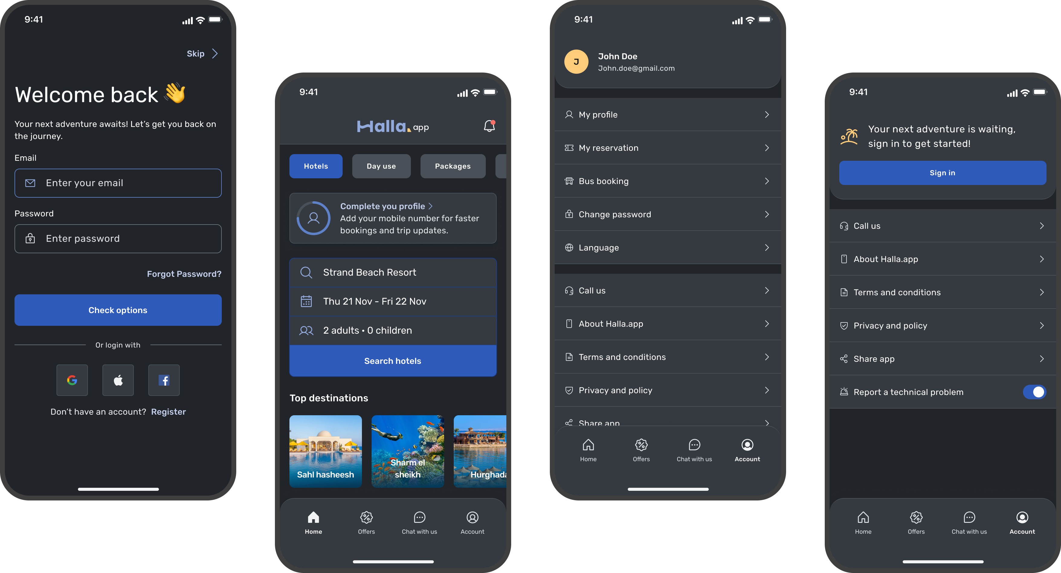
I built Halla on a token-driven system: type (Rubik), color and spacing all sit on shared primitives, with semantic tokens that swap cleanly between light and dark. A single change ripples across iOS, Android and every future screen — components are composable and theme-aware out of the box.

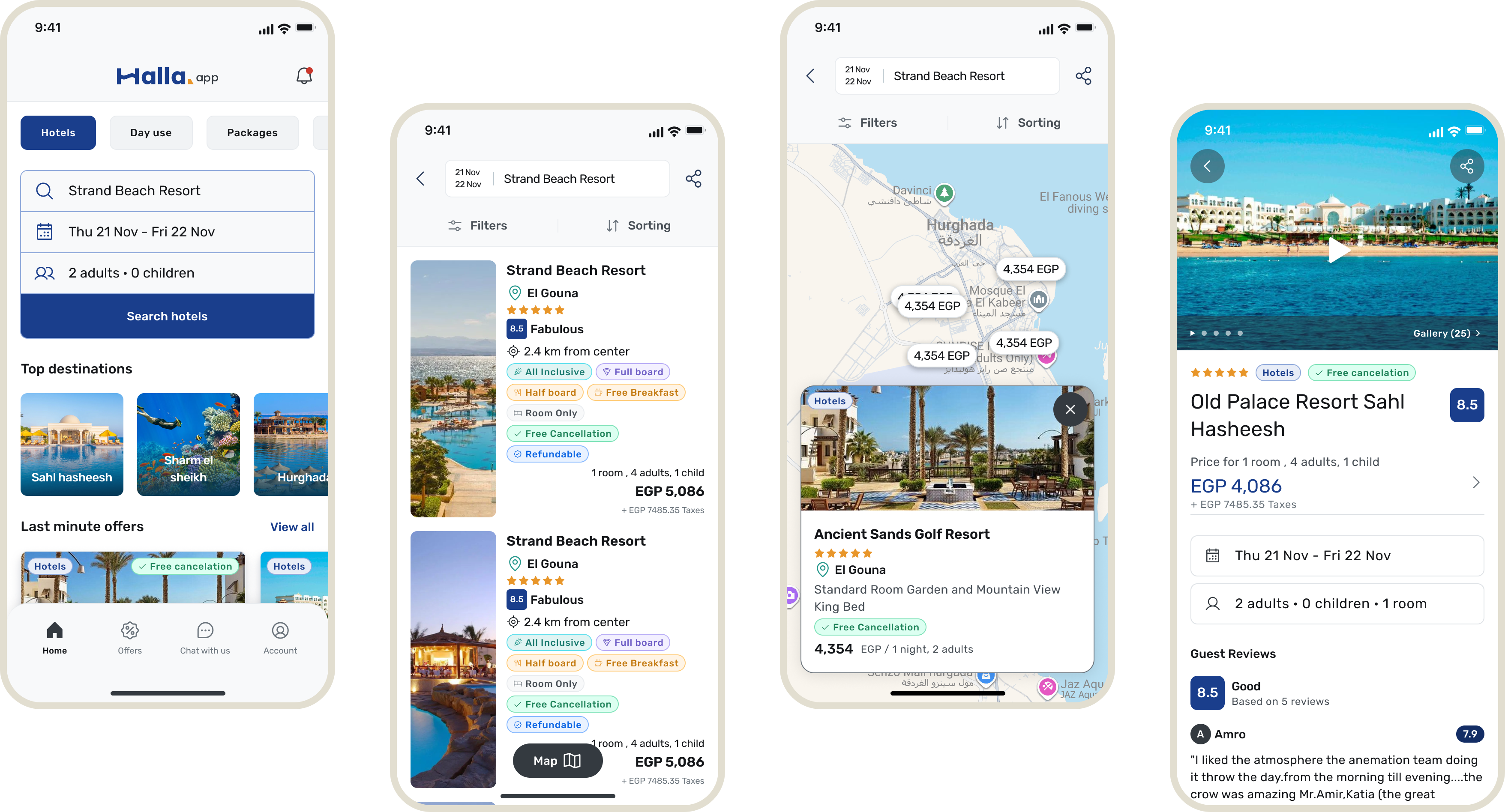
From flow to finished screens
With the foundations in place, I designed the core experience end to end — starting from a home that inspires, then narrowing into a fast, transparent path to book and pay.
Built for the night flight
Dark mode isn’t an afterthought — it’s a first-class theme driven by the same semantic tokens. Primitives stay mode-agnostic; only the semantic layer swaps. Travel happens at odd hours, and the dark theme keeps Halla comfortable on a red-eye and calm in a dim hotel room.
The hard parts
- Complex booking data. Flights, hotels, tours and packages each carry different rules — the UI had to stay simple while the data underneath got messy.
- Designing for trust. Transparent pricing and clear confirmation states had to do the heavy lifting of reassuring first-time bookers.
- Organizing large content. Destinations, offers and itineraries needed structure that scales without overwhelming the home screen.
- Payment flexibility. Supporting local payment methods alongside cards without bloating the checkout.
- Scalability. Every decision had to survive the next ten features the team hadn’t designed yet.
What changed
- A scalable, token-driven design system the team builds on today
- Consistent visual language across iOS and Android
- A modernized brand that feels trustworthy and distinctly Halla
- A simpler booking experience — fewer steps, clearer pricing
- First-class dark mode shipped from launch
- Foundations ready for the product’s next phase of growth
The real win: the system. Designers and engineers now ship new travel features faster because the foundations — type, color, spacing, components and dark mode — already do the heavy lifting.
What I took away
Owning both the brand and the product taught me how much smoother things go when identity and interface are designed as one system rather than handed off in stages. Tokens were the bridge — they let the brand live everywhere without me policing every screen.
If I did it again I’d invest in usability testing earlier, before the system hardened, and pull engineering into the token decisions from day one. Balancing a warm, branded feel with the clarity a booking flow demands is a tension I’ll keep chasing.